Hector Manuel
Hector Manuel logo and product label design.
Hector Manuel
A small local company asked me to design a logo for their new salsa company. They didn’t give me any requirements or suggestions. They said go with what you like and that would fit the product. I researched salsa and Latin American food logos and decided that they all looked the same. They used similar looking imagery and color schemes. So I decided to go a different route. I looked at Latin American culture and decided to go with a Mayan theme. The Mayans were one of the biggest cultures in the area of their time, they also had a lot of cool imagery and color schemes. I had also been to some of the Mayan ruins in Mexico, so I had first hand knowledge of some of their history.
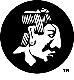
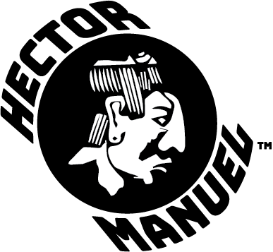
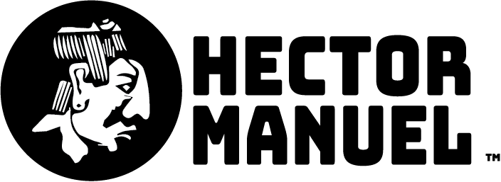
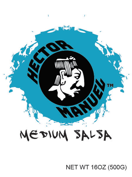
I decided to go with a Mayan priest or warrior head that I kept seeing in their hieroglyphics. The head had a distinct look to it. I wanted the head to stand out, but not be overbearing. So I chose to have the head be white in a black circle. I gave the client other color options, but we both felt that this was best looking.
I gave the client a couple of different options for font and text placement. I wanted to use a masculine font, because the name of the company is so masculine. They chose a thicker square font. The client wanted to see different font placement with the head. The options they liked were the text to the right and wrapped around the head, but slightly offset. They decided to use both.
After the client decided on the logos, they wanted me to design some mock-ups of labels for the product. They again didn’t give me any requirements, they also didn’t have any kind of color scheme in mind. I again research Mayan colors and found that they used a lot of reds, blues and greens, so I decided to go with variations of those.
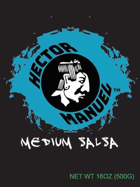
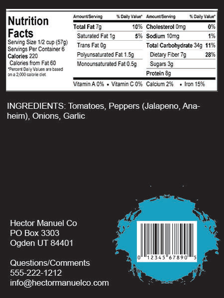
The client hadn’t decided on packing yet, so they asked me for two types of labels (wraps and verticals). For the vertical labels I decided to use the round logo and place that in a teal paint splatter, so the logo would really pop. I then used a weathered font for the product name. For the product details I used a green sans serif font, so those details would be easily seen. On the back of the label I put the nutritional facts and ingredients. I can’t do much with the nutritional facts, because of food label regulations. I then placed the same paint splatter on the back and put the UPC label on top. This gave the UPC some visual contrast and would make the product scan better. I made the labels with both a black and white background, so the client could see the difference.

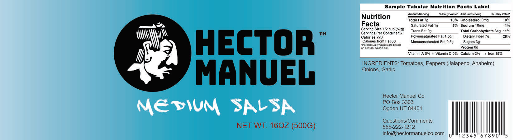
The second label was a wrap based design. I used a teal gradient as the background to give the label some color and keep with the color scheme. I gave samples of the label using the two different logos. I used the same weathered font from the vertical label, but made the text white to contrast the black logo text. I then used a burnt red color for the product details. I tried the same green color, but it was too washed out on the background. The two labels have the same information on them, but are just different types of labels.

Overall, the client was very happy with their logo design and thought that it would make their product stand-out when placed next to existing products. They were also happy with the two types of label designs. They liked my out of the box thinking for the logo and label designs, also with the color scheme.