The Front Climbing Club Website Redesign
The Front Climbing Club Website Redesign (Work In-Progress)
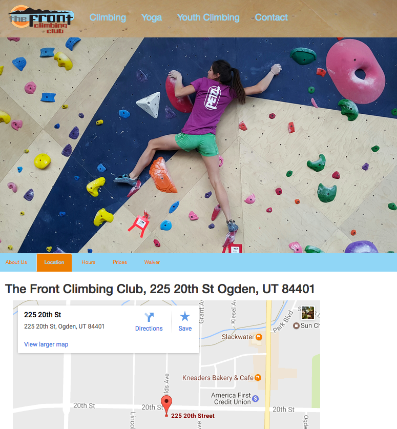
This project is a personal redesign of The Front Climbing Club’s website, not asked for by the company. I thought their website could use an update and I wanted to try different layout and design techniques. I wanted to try a single page website with all the information on one page. For the design elements I wanted to stick with similar colors and backgrounds from the original website. I used an image of the climbing wall as the background for the navigation and footer bars. I then used colors from the logo as the colors for the navigation text, tabs, accordion and buttons. For the layout I wanted to try an alternating content layout. I alternated the images and content. So if the image is on the left then the content is on the right, then the next section the content is on the left and the image on the right. I thought this layout was a good visual break for each section.

Start of Page
The different sections are divided by type (About, Climbing, Yoga, Youth Climbing). Each section also has the text content divided into different sections, there are about 4 sections each. I used tabs to separate the content. When each tab is clicked the image is changed.
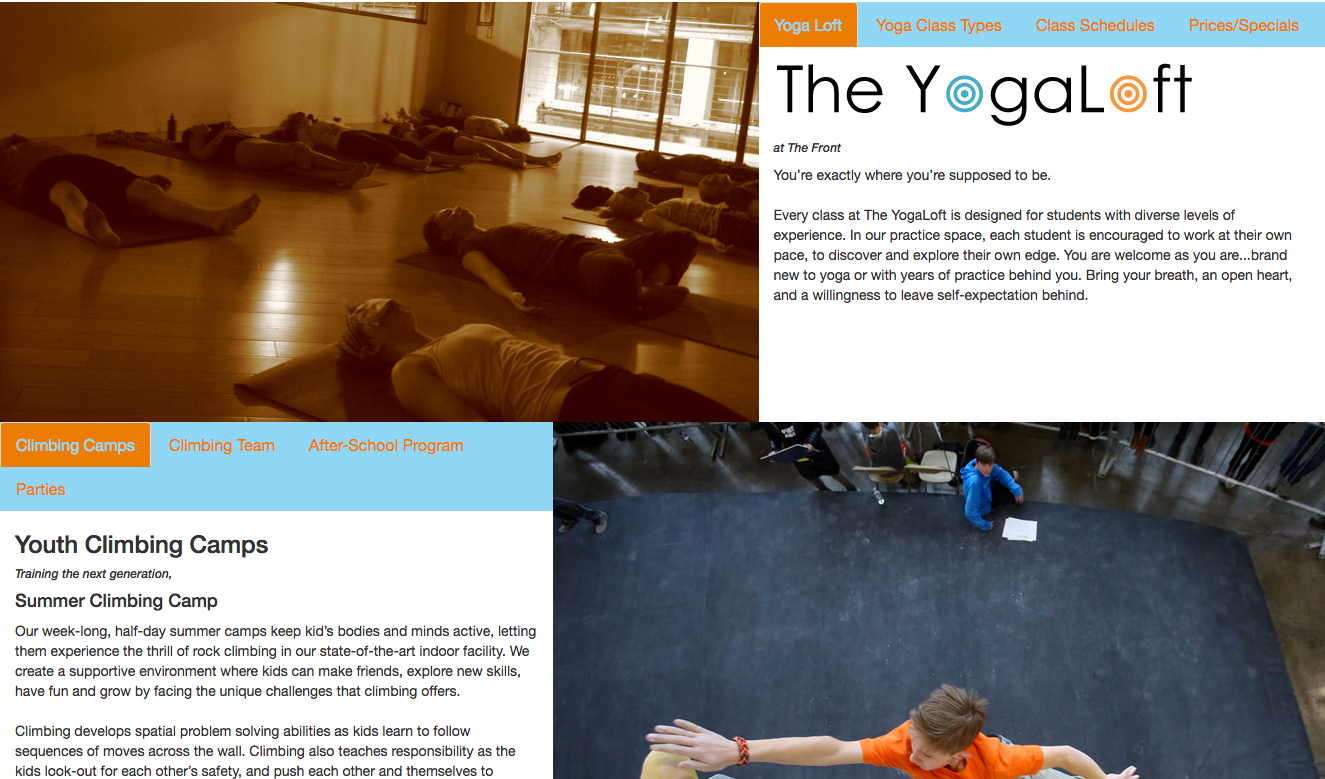
Rest of Page
This is showing the rest of the page, showing the content for Yoga and Youth Climbing. The reason the Youth Climbing tabs has two rows, is because I had to shrink the page in the browser to get the screen shot.

Showing Accordion Element
If one of the content sections had a lot of text on it, I decided to use accordions to section the content even further. This allowed me to save space and keep the blank space below the image to a minimum. I used the dark orange as the background to the accordions to differentiate from the tabs. I used a lighter orange on the text so it would stand out. The lighter orange also kept with the natural colors theme the logo has.
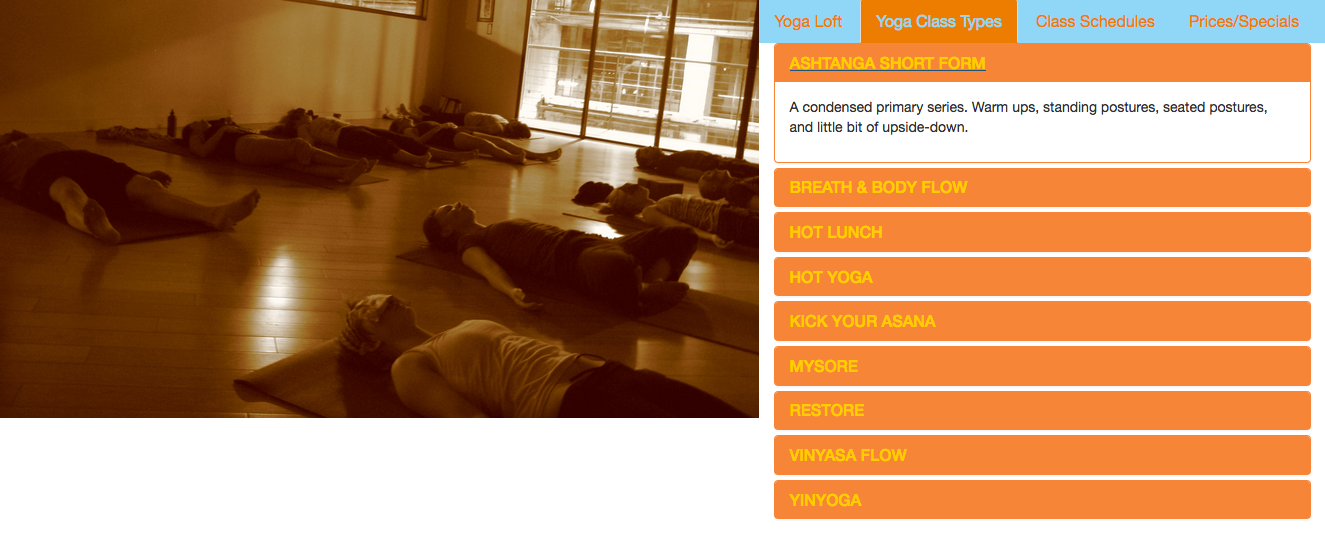
Another Accordion Element Usage
This image is showing the accordion element used to separate the different types of yoga. Each accordion text is the type of yoga and description text is inside the accordion. Using the accordion element allowed me to put all of this information in a much smaller space.
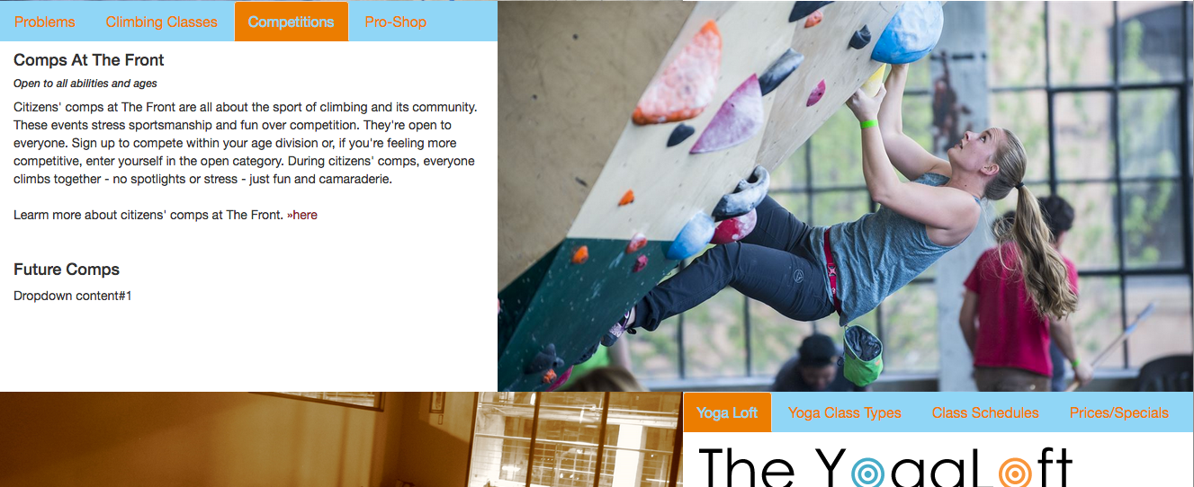
Showing Image Change
This image is showing how the image changes when a different tab is clicked. I used a jQuery function to change the images when a tab is clicked. The function only changes the image related to the section the tab is in.
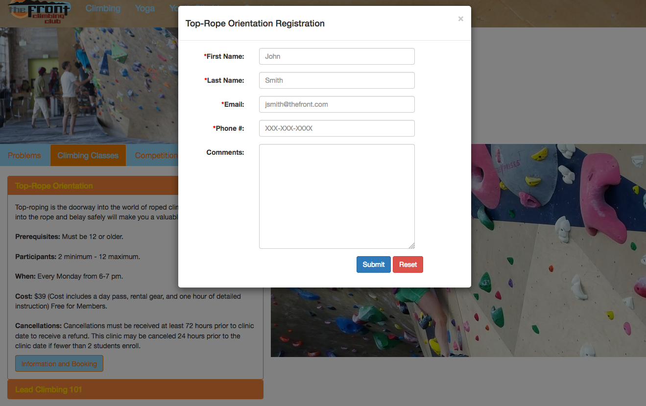
Showing Modal Used For Class Registration
I used a modal to show a form for class registration. This allows the user to register for classes on the same page. This also made it easier to code. I am going to use PHP and MySQL to send an email and also input the data into a database (working on this).
Showing Responsive Design and Layout
This image shows how the layout changes depending on screen size. I used Bootstrap and jQuery to change the layout of the website. Bootstrap will change parts of the layout natively by wrapping divs placed in the same row. I used a jQuery function to figure out the screen size, then depending on the screen size the layout of the entire website is changed. This allowed me to keep the images on-top of the content and keep a more fluid design.

Contact Page
The contact page is the only other page in the website structure. I thought it would be easier for the user to see and use a contact form on separate page. I am going to use PHP to send an email to the user and company (working on this). This will allow both parties to receive the same information.